We designed Leadvengers App to help you receive secure and registered live transfer leads.
We ensure you leads generation process in compliance with Telephone Consumer Protection Act (TCPA) guidelines.
Your telemarketer or lead vendor can now direct leads to a simple landing page to opt-in in just few seconds.
Achievements
Conceptual Design
Visual Design Language
Digital Strategy
UX/UI Design
Design Strategy
What we Did
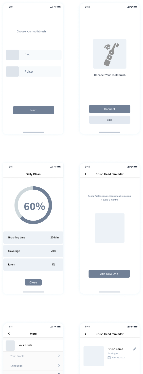
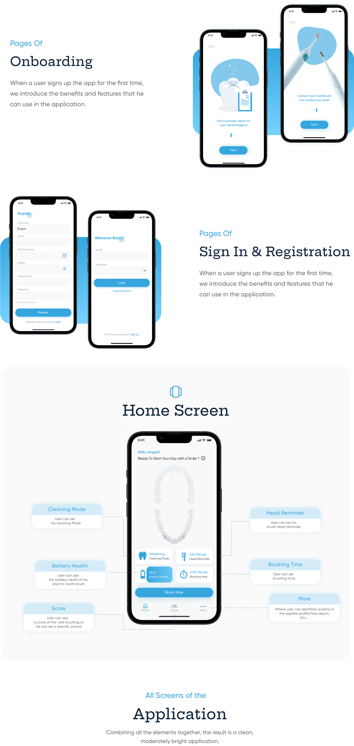
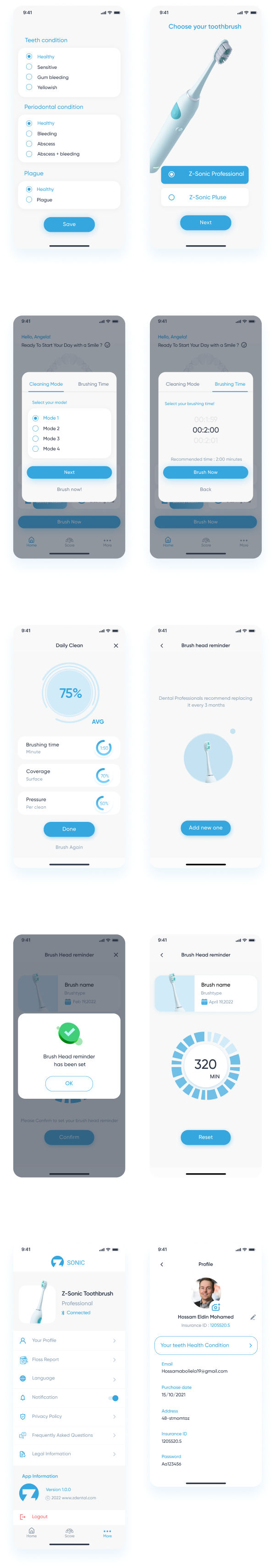
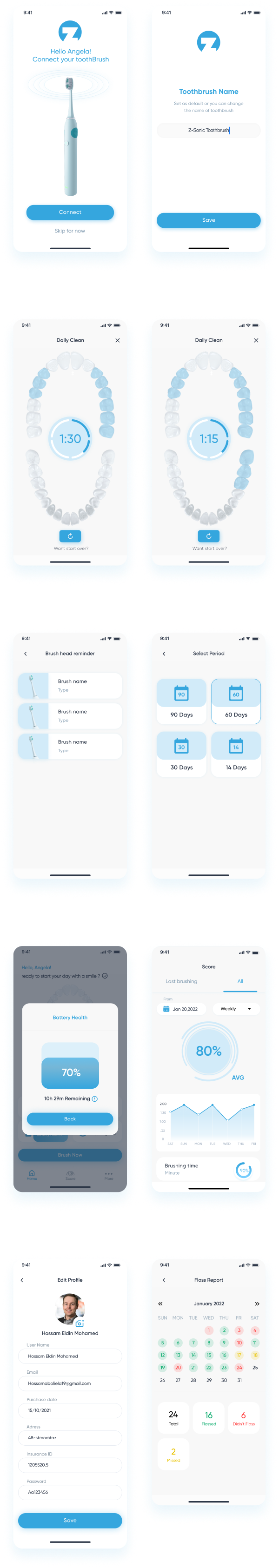
This Mobile App will provide users to Keep their teeth healthy and clean by Getting a periodic report on their dental hygiene , they can set brushing time and set a brush head reminder and cleaning mood and they And while brushing their teeth, they can see how it covered
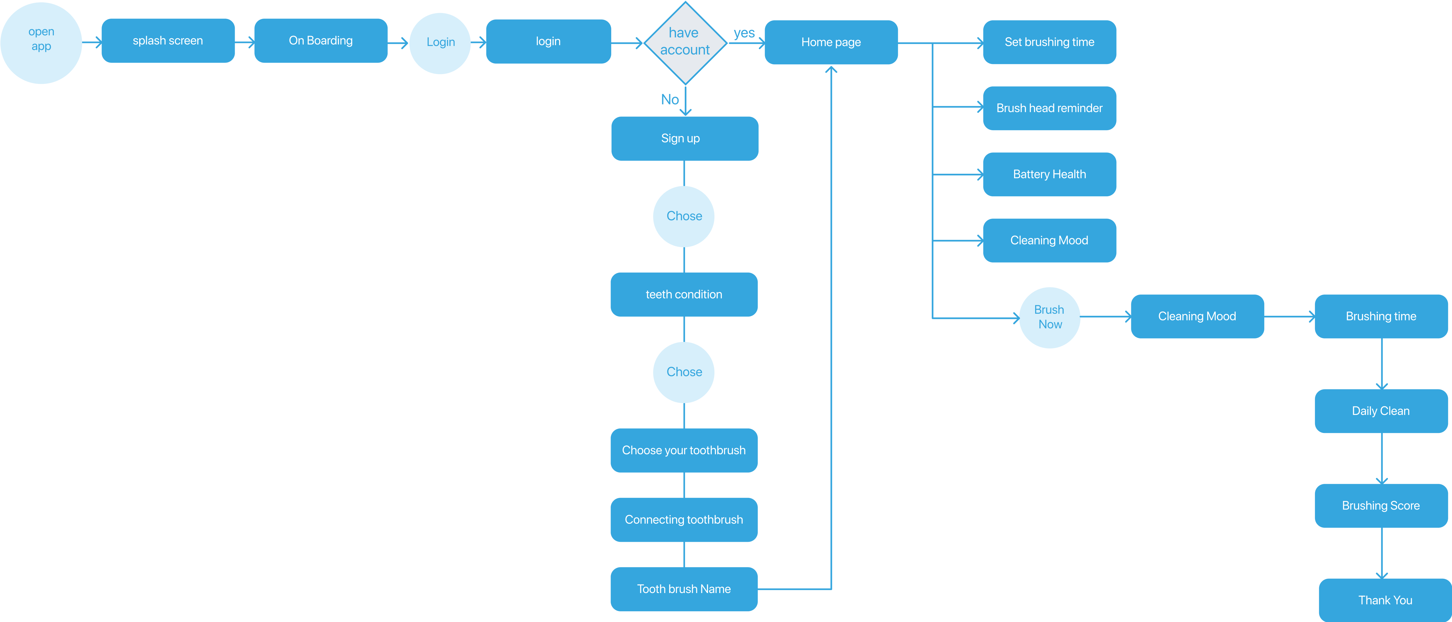
User Flow
User Flow
In order to design the best experience
We’ve look at the possible paths the user might take during their journey and examine what happens during each step. I usually create a map in Figma to get a detailed view of the User Flow.
Wireframes
Wireframes
Based on the research conducted at the UX stage
we started developing wireframes. It was important to conveniently arrange the elements on the screens and provide an intuitive structure of the application.
Style Guide
Style Guide
We wanted to choose a bright and eye-pleasing color palette
and readable front, as the application will be used on all phone sizes.
Colors
01
Typography
02
Iconography
03
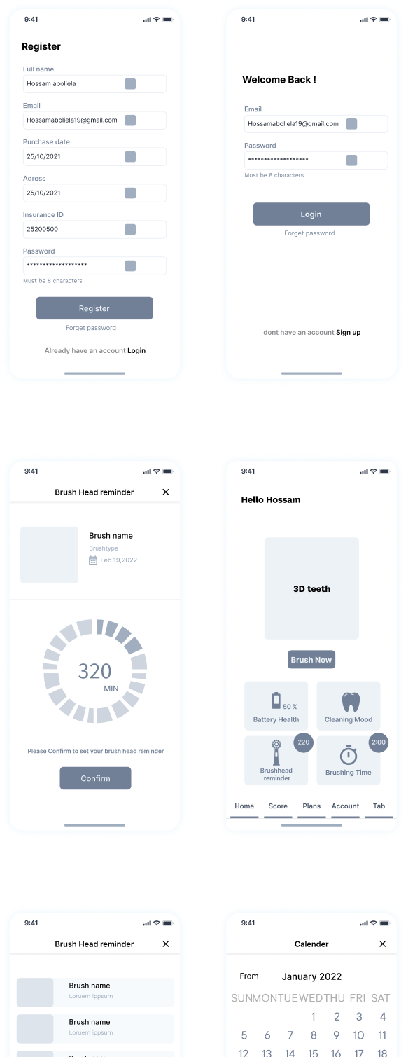
Screen Preview
Screen Preview
Below we will take a look at the most important website pages separately.
Explore more work
Take a look at our most important & Interactive projects


